Are you happy with your freelance writer website? Does your professional site do enough as a marketing tool to attract prospects and help you convert them into clients? Do you even have a website yet?
As strange as it sounds, this post has been a few years in the making. For quite some time I've wanted to do a round-up to showcase quality freelance writer websites to help new freelancers build their own, and to help more experienced writers improve their sites.
Why did it take years? Frankly, it's never been easy to find so much as a handful of truly high quality freelance writing sites I felt comfortable putting in front of you as examples. And I'll be up front. These aren't perfect either. But they all have strengths I felt newer freelancers could learn from, especially when writing the copy and structuring the content for marketing-oriented professional sites.
So today we're going to look at professional sites from five freelance writers -- Cathy Miller, Sharon Hurley Hall, Alex Sayers, Rose Wheeler, and Ronda Swaney. I'm going to share my thoughts on some of the highlights, but I'll also share suggestions on things they either might want to improve, or things you might change if you were to build a similar site to theirs today.
Throughout the rest of this month, we'll look at a few individual site reviews as well -- starting with my own next Monday, so I can walk you through some of an audit process for updating and improving an existing site. And all month long I'll share tips and resources to help you build or refine your site to make it a stronger marketing and PR tool for your freelance writing business.
But for today... let's get right into some examples. Here are five freelance writer websites that have strengths you can learn from.
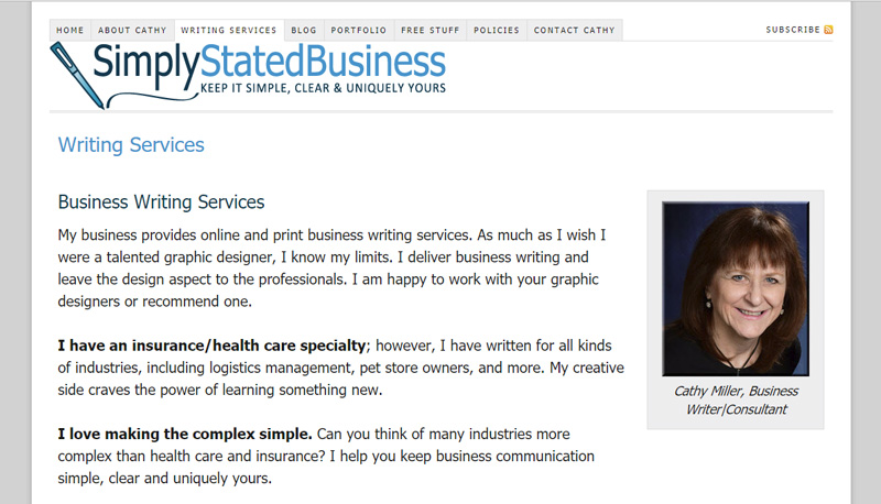
Cathy Miller
Cathy is a business writer with over 30 years of professional writing experience and a specialty covering insurance and healthcare. She takes on both print and online projects including case studies and white papers.
In Her Own Words
Originally, SSB was my business site with my portfolio, background, etc. I started my blog to showcase my writing but also to establish my brand as “keeping it simple.” My niche is anything but.
The repeated theme of keep it simple attracted clients from my niche who struggled with communicating the complex world of health care and insurance. It has also attracted businesses outside my niche. Simple works.
Why This Site Works
I've known Cathy longer than I can recall at this point. You might have seen me refer to her here before as one of my "go-to gals" (which also includes Lori Widmer and Yolander Prinzel). I was initially hesitant to include someone I knew as well as Cathy in a post like this, but one thing cemented her spot here -- she has, hands-down, the best freelance writer website I've come across.
Is Cathy's site perfect? No. None are. And we'll get to some suggestions shortly. But she gets something right that far too many freelance writers get wrong. What is that?
Cathy turned her site into a true resource for clients.
Simply Stated Business isn't just a sales tool to promote Cathy's services. It features one of the best client-focused blogs I've seen on a freelance writer website. (As a fellow business writer, I've found plenty of interesting tips there myself, and I consider Cathy a go-to source on things like LinkedIn and case studies.) Her site also features a rather large collection of downloadable marketing and business writing resources.
Why does this matter? Because turning your professional site into a true resource in its own right keeps prospects coming back. They won't always be in a position to hire you when they first find your site. Give them a reason to keep coming back, and your name will be the first that comes to mind when they are ready to hire someone in your specialty.
Highlights
Here are some of the things I love most about Cathy's site, Simply Stated Business:
- While there's nothing wrong with personal branding as a freelance writer, Cathy overcame having a common name by going with a strong, clear business brand.
- Cathy's blog content is outstanding. More important, it's genuinely helpful to clients and prospects -- not just promotional posts.
- Her site is an all-out resource even beyond the blog thanks to a comprehensive collection of downloadable resources.
- Cathy's site features individual service pages to promote key services (good for SEO, but also for landing sales for higher-ticket services).
Suggestions
Every freelancer's site can be improved in some way. If I were building Cathy's site fresh today, here are some of the things I'd do or suggest:
- I'd put more visual emphasis on CTAs (calls-to-action). Instead of simple "Contact me" links within text, I'd add buttons or CTA boxes to make them stand out.
- I know this sounds minor, but I'd increase the space between list items. Where Cathy has single-line lists, they look great. But with multi-line list items (like on her Free Stuff page), the lists look like several paragraphs running together. This can make text a bit awkward to read, and it's a common problem with WordPress themes right out-of-the-box.
- I'd make rates much easier to find. Cathy does have some rate guidelines on the site, but they're buried in a .pdf that's linked to in the copy of service pages. I'm a big proponent of making your rates public. But they only help when prospects can find them.
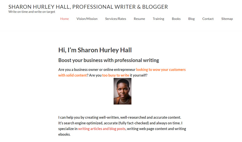
Sharon Hurley Hall
Like Cathy, Sharon has over 30 years of professional writing experience. While her site says she doesn't really have a specialty, I can tell you Sharon's built quite the name for herself in the freelance blogging community.
In Her Own Words
My website has been an invaluable tool in bringing clients to me. In the last few years, most of my clients have found me. There are a few decisions I took to help make that happen:
- I optimized a couple of key pages so they appeared in search when people were looking for writers.
- I added a plugin to pull content from the different sites I wrote for and update my portfolio page.
- Putting guide prices on my site brought me more high-paying clients
- Adding logos of the sites I've written for was a good marketing tool (though I'd like to make them look more attractive
- Changing the content mix to include content helpful to potential clients plus updates about my recent work also my skills.
As you can see, most of these are content decisions, as I'm not really a designer. That'll be the next area to focus on.
Why This Site Works
Okay. I love Sharon. But I have to say this isn't a site I'd recommend modeling yours on visually. It needs work on that front, but I also know Sharon's aware of that based on her feedback on her own site (which you can read below). Where Sharon's site shines is the content -- and that's what you, as writers, have the most control over.
For the most part, Sharon gives prospects what they'd want to know, and things are easy enough to find (with a couple of exceptions I'll mention in the suggestions).
Sharon does a great job of highlighting her extensive experience throughout the site, from her resume to her portfolio, and even right on the homepage where she showcases some key clients. And, again like Cathy, she offers resources that can genuinely help prospects (and give them a reason to come back). In her case, Sharon has some blog posts targeting clients, but also training materials like SlideShare presentations on topics she's previously taught.
Highlights
Here are some of the best elements of Sharon's copy and how she's laid out her site's content structure:
- Sharon's portfolio updates in her blog might not be necessary, but it's different and it lets clients see what she's been up to most recently.
- While I have a suggestion related to her Vision and Mission page, I think having this on her professional site is a perk. While traditional businesses do this regularly, freelancers often don't. But when you're operating under a personal brand, this kind of information can help you close a sale because it gives prospects an idea of who you are and what you would be like to work with.
- Sometimes prospects find your site before they're ready to buy. And that's why I mentioned earlier that it can be a good idea to make your site a broader resource to keep them coming back. This doesn't only apply to freebies though. You can sell paid products as well. These kinds of client-focused products, like Sharon's books on blogging and writing for the web, give prospects a glimpse of what you do, but also an entry purchase. In essence, it's a way to make money even if someone can't afford to hire you yet (or they aren't sure they need you) by teaching them the basics of what you do. It sounds counter-intuitive, but in my experience, when prospects try the DIY route, they often realize the value of what we do and it makes them more likely to hire a pro for their next project.
Suggestions
I won't give much design advice here because it sounds like Sharon knows the site theme could use an update. But here are some things that jumped out and what I'd suggest:
- Be careful with bold copy. The homepage is pretty much all bold text, and when everything is emphasized, nothing is emphasized.
- Also be careful about alignment. The heading and main navigation being misaligned gives the site a lopsided look on first impression.
- While the site is fairly easy to navigate, a couple of things jumped out from the perspective of someone who's hired writers. One of the first things I look for is an About page. That's where I learn if a writer has the experience or credentials to A) be someone I can trust, and B) be worth the rates they quote me. The About page is buried here. Ideally I'd combine it with the Vision / Mission page. otherwise, I'd put the About page in the main navigation and the other beneath it.
- Same for the Resume and Portfolio pages. I'd switch that setup and focus more on the portfolio.
- Blog more. Sharon has some client-focused posts, but uses the blog also to highlight recent projects, like an extension of her portfolio. But Sharon is also reasonably well-known as a blogger. So her own blog is, in essence, a portfolio piece. That said, with Sharon's experience it's possible she doesn't need a steady stream of prospects from her blog. But in the sense of using Sharon's site as a model as you build a new one of your own, you'll want to blog more often and more regularly than she does right now.
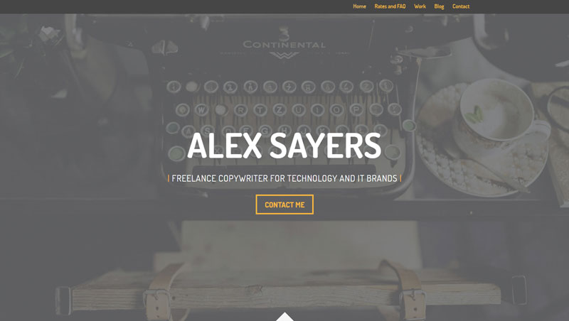
Alex Sayers
AlexSayers.co.uk
Alex is a UK-based freelance writer with 3.5 years professional writing experience, coming from a marketing agency background. He specializes in working with tech-oriented clients, and his services include copywriting and blogging.
In His Own Words
I put my website live almost immediately after going freelance back in 2016. I’d worked for a marketing agency previously, so I had a little experience with WordPress, SEO and web design which definitely helped with getting it off the ground.
Recently I’ve decided to add my prices to the site alongside some FAQs that help to describe my working process. I’d always been a little unsure about making my prices public because I was worried that it would put off potential clients from contacting me. But, after speaking with other freelance writers, I’ve decided to give it a shot.
I’m hoping it will help to ‘pre-qualify’ the people who email me - they’ll already know what to expect from my quotes and it should cut down on time spent working out whether I’m a good fit for a client’s needs.
Why This Site Works
Alex's professional site does a good job of keeping the focus on what clients are looking for. Service basics are right on the homepage, as is some background on his professional experience. And if prospects need to know more before reaching out, he's made it easy for them to access his portfolio and further service details (using bold buttons as opposed to simply tucking text links into the copy).
The site features more than just a list of services. While he doesn't have dedicated landing pages for each service he provides, Alex does offer service-specific pitches on a main Services page. And while his portfolio looks simple on the surface, he offers more details about past client projects than most freelancers I've seen.
Rates are clearly laid out for prospects (something I believe wholeheartedly in including on your freelance writer website), and he answers common client questions in an FAQs area.
For the most part, the site is easy to navigate, key info is there, the copy is well-written and has a distinct voice, he makes it easy for prospects to contact him, and he even has a client-oriented blog. That's a great idea for your own SEO and to showcase your knowledge, but Alex also does a good job of incorporating CTAs directly in his blog posts.
Highlights
Here are some of the best things about Alex's professional site that help him stand out from the competition:
- Alex's personality comes through clearly in his copy. Clients don't only find out what experience he brings to the table, but he lets prospects see who they'd be working with if they hire him. If you choose to go with a personal brand over a more traditional brand (like Cathy's Simply Stated Business), this kind of authenticity can be the difference between you and the prospect's second choice.
- The site's design is fairly clean and easy to read and navigate. Normally you don't want a lot of CTAs on one page, but his homepage employs several well, making it more of a portal, directing visitors throughout the rest of the site.
- I like the way Alex breaks down rates for his primary services into package prices. This is something I personally go back-and-forth on, but have been leaning towards in my next round of site updates, so I especially appreciated seeing this done well. If you tend to write smaller pieces -- blog posts, press releases, or copy by-the-page for example -- this kind of package pricing can help you focus more on regular clients and build steadier income streams.
- I love the details provided when you click on portfolio items. You're not simply shown a sample, but are instead treated to background that almost serves as a mini case study for each project. This is one of the best portfolio sites I came across when reviewing and choosing writers' sites for this round-up. Well done.
Suggestions
Here's what I'd suggest if Alex wanted to improve his site or if you wanted to build one in a similar style:
- Add an About page. Right now there's some bio info on the homepage and more in the FAQs. I'd suggest putting them together into their own page, making it easier for prospects to get to know you through a familiar page most are used to looking for a link to.
- Along those lines, I'd break the FAQs away from the Rates page. The rates section has CTAs. You want prospects to act. But then there are FAQs below, giving clients a reason to keep scrolling rather than clicking those contact buttons.
- I know this might seem like a nit-picky thing, but please add dates to blog posts. It's a trust issue. Prospects should know if your content is up-to-date or not, especially if you talk about anything timely or reference statistics that can change. Trust should always be a priority, especially when your entire business as a freelancer relies on it.
- And along those lines, be careful about the sources you reference in blog posts. The very first post features widely-spread, notoriously poorly interpreted and presented data. Remember, popularity of a source does not equal reliability of data, especially in the internet marketing community. Don't share charts or data from other bloggers' "studies" unless you're certain about the validity of the claims they make and understand the methodology they used to get those numbers. That applies to every blogger, in everything you write, whether for your own site or those of clients.
- Optimize images in your portfolio. Some of these on project pages are well over 1MB, and you have multiple images on some pages. This slows down load time on pages that best showcase what you can do.
Visit Alex's site.
Rose Wheeler
Rose began writing about 9 years ago when she started blogging for her own indie boutique. Now she works as a content manager and writer for lifestyle brands, managing their blogs, social media accounts, newsletters, and communities.
In Her Own Words
Over the years, I've changed the design and content of my site at least once a year. Mostly, because I like updating the look of the site but also because my writing specialty has changed over the years. I started freelancing around ten years ago as a writer, web designer, and digital marketer. I thought I could do all of it and it was a huge mistake. Around year two of business, I learned to focus on my favorite skill (writing) and develop my site to focus on that.
When I started working as a content manager for a big project, I decided to add those services to my site. Now, I do that part of my business for two big brands but also for ladypreneurs so I tailored my site to reach them. The current design of the site I don't plan on changing anytime soon for the first time it really feels like me. I'm girly and love writing about lifestyle topics and entrepreneurship, so this site reflects that.
Funny enough, the best clients I've gotten has been since deciding to change the design, content focus, and my social content to be more personal and focus on the things I love. For my writing work, my blog and portfolio showcase the type of project I enjoy doing.
Why This Site Works
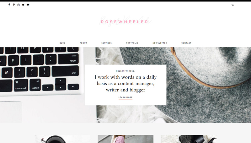
Rose's site does a good job of combining aesthetics and substance in a way that's well-suited for her target market -- lifestyle brands. From color choices to images, the site is going to immediately appeal to the kinds of clients she aims to work with.
Digging into that substance more, Rose covers the basics well. It's clear what she does, who she does it for, and what it will cost to hire her. She also gives prospects multiple contact options, but she keeps control over that process which is important. For example, she'll do phone consultations, but only by appointment (something I highly recommend as someone who's had international clients think they can call at all hours once they have my info). And she goes beyond a standard contact form to include purpose-oriented filters that can help prioritize the emails she receives.
If you were building a brand new site for your freelance writing career, Rose's would be a good model on the content front. It has room to grow resource-wise, but it covers all the basics of what you'd need to get started.
Highlights
Here are some of the stand-out features of Rose's freelance writer website:
- The design is very well-suited for her target market. While copy matters more given the nature of our business, if you can strike the right balance between that and client-appropriate design, your site will be well ahead of most competitors.
- I'm a little torn on the blog's subject matter. Ideally you want your blog to focus on your client's needs. But Rose's takes an alternative approach that can occasionally work -- focusing on your specialty subject matter or industry. This is more important in consulting than freelancing, where your blog can be an exercise in thought leadership within the industry. I don't think that's necessary in Rose's case, especially given that she has a fairly extensive blogging portfolio already. But it is a good example of this kind of approach to a professional blog, in that it's almost a portfolio piece on its own. So don't assume this is the right type of professional blog for you. But if you do know this is the kind of blog you want to run, Rose's is a good model to look over for inspiration.
- I love Rose's contact form. Rather than simply having prospects send a message, she uses the form to gather extra info that could help her in deciding how to respond. For example, she gets the contact's website address so she can learn more about them if they inquire about her services. She has them choose between a couple of contact reasons, making it immediately clear if someone reaching out is a prospect or if they're contacting her for other reasons. And she asks people how they heard about her. This is a simple type of market research giving her insight into what marketing is, and isn't, working to drive prospects to her virtual door.
Suggestions
Here's what I'd suggest to improve Rose's site, or things I'd do a bit differently if building a similar freelance writer website from scratch:
- I mentioned this for Alex's site, but again, add dates to blog posts. This is even more important in Rose's case because she's talking about timely topics. Oddly, in the "related posts" below individual posts, the dates do display. But they're not on the individual post pages themselves. So there was one post offering fashion trend tips that I could see was from 2011. If you stumbled onto that post via a search engine instead of that "related post" link, you wouldn't necessarily know the advice was outdated today.
- Blog more regularly if you want the blog to serve as a sort of niche specialty publication. I had to look at the post's source code to see the most recent one was published last August. Again, when dealing with timely topics (even if not exclusively), you'll want to focus on consistency. That's especially true if you're selling services like blogging and content management because you want clients to see you can manage your own content calendar.
- Make the newsletter more client-focused. It seems a bit too general in this case: "fun stuff I find online -- from what to binge-watch next to yummy recipes." Again, where you're marketing yourself as a content manager, it becomes even more important to show you can build your own content strategy around your target visitors. That's not your clients' target readers -- it's your target clients themselves. On your freelance writer website, that's who you're writing for. So rather than covering those lifestyle issues in this kind of a general way, focus more on the "action steps" mentioned. Speak to lifestyle brands and those behind them about how they can use content, copy, and the other services you offer to appeal to their own readers or customers. It's absolutely possible to focus content on clients while writing with a very personal style, which has worked well for Rose so far.
Ronda Swaney
Ronda is a freelance business writer with over 20 years of experience. She specializes in working with technology, IT, and healthcare industry clients. Her projects range from blogging to writing more traditional technical documents like white papers.
In Her Own Words
One of the smartest things I ever did for my business was to define what I do and who I work for. I then made that message clear on all my platforms—my website, LinkedIn, Twitter, and even my email signature. That clarity transformed how people found me. I almost never have to do outbound marketing now. Most of my prospects come to me.
Like most freelance writers setting up a website, I debated if I should include my phone number. You read all the horror stories about phone calls at all hours, your number being scraped and sold to marketers, or the risk of harassing phone calls. When I set up my site in 2010, I decided to take a gamble and include my business phone number. I can honestly say that none of those horror stories ever came true. I don’t get spammy or harassing phone calls ever. I can’t say why exactly, except perhaps the horror stories are overblown. I’ve also had prospects tell me how grateful they are that I include my phone number because many writers don’t.
A lot of writer websites have only a list of links as their portfolio. Even if that list is impressive, I think it looks really boring. I chose a theme that offered a more visual approach. I think it draws prospects in and makes them want to spend time exploring my site. Plus, good stock photography is another way to visually communicate exactly what I write about.
A debate writers often seem to have is whether or not to post rates on their site. Some argue that it limits your negotiating power. For me, posting my rates was a good decision. When I first opened my business in 2010, one of the most irritating productivity killers for me was getting calls from “tire kickers” — people who thought they might want to hire a freelance writer, but really had no idea what was involved or what professional writers charge. Posting my rates stopped that cold. Now the only people who contact me are serious prospects who understand that good writing isn’t a commodity.
Why This Site Works
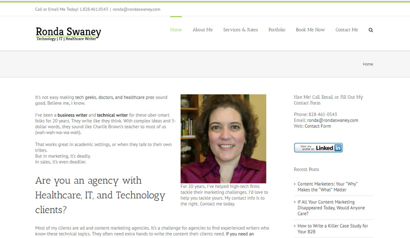
Ronda's professional site is a very simple, traditional site. And that can work well when targeting the kinds of markets she is -- decision-makers in equally traditional business environments.
She emphasizes a key benefit to her services -- making difficult and highly-technical content more interesting and easier to understand. And I think the copy on her own site demonstrates her ability to write in a very relatable style which can be the difference between effective and incredibly dry technical copy.
Ronda has a comprehensive portfolio and mini case studies (as with one of the previous sites included here). Her rates are easily accessible to prospects. She covers common questions. And she makes it easy for prospects to reach her. So again, here's a decent general example of the kind of content you might want on a new freelance writer website.
Highlights
Here are some of the positive things that stood out about Ronda's site:
- The very traditional site structure and design here is simply a good fit for the kinds of clients Ronda targets. That doesn't mean yours should necessarily look similar. But follow that example and know your audience. If you focus on more creative industries, a more creative site makes sense. If your clients are business owners and executives, a traditional site structure can be more familiar to them and easier for them to navigate.
- Ronda makes it immediately clear, right on her homepage, who she works with and what primary benefit she brings to those kinds of markets and the type of content and copy they most often need.
- It's very easy to figure out how to contact Ronda (aside from the LinkedIn button visually pulling attention from nearby contact info). There's contact information and links to the contact page pretty much everywhere.
- Her portfolio not only features plenty of examples of Ronda's work, but it's broken down nicely based on the different industries she works with. So, for example, healthcare clients and technical writing clients can easily find the most relevant samples. Prospects don't need to see a lot of samples to make a decision. Many won't bother reading any at all. But when they do, what matters is relevance, especially when you market yourself as a specialist in a niche or industry. Show your targets you can handle the exact kinds of writing they're looking for.
Suggestions
After reviewing Ronda's site, here are some suggestions I'd make:
- Give your copy formatting a once-over. On most of the site this issue doesn't exist, but in a few areas I noticed a lack of spacing between paragraphs, causing copy to run together in a way that's distracting to read. You can see this clearly on the homepage. It starts off with proper spacing between paragraphs, but then they seem to turn into line breaks (both in the first section of the page, and the last section).
- I'd remove the LinkedIn button in the sidebar or replace it with something smaller (or just a text link). Right now it's the most prominent CTA , and it draws attention away from the contact links that get prospects to actually reach out to discuss their projects. It's not bad to make it available. You just don't want it overshadowing your main CTA for any page.
- There were some slow loading issues on the site. I noticed it on several internal pages, but especially when clicking portfolio items. Run speed tests to see where the problem might be -- it could be anything from un-optimized images to issues with plugins if you're using a content management system like WordPress.
- Consider combining the "Book me now" and "Contact me" pages. There are two confusingly-similar pages right in the main navigation. And there's not much content on either. There's no reason the link to the appointment calendar can't just as easily be above the contact form. Doing this would also let you bring the blog link up to the main navigation bar. Right now it's hidden beneath "About Me," which isn't an intuitive place for something like that.
- I know this is now the third time I'm saying this, but include dates on blog posts.
And there you have it -- five freelance writer websites you can use for guidance when building or improving your own. I'd like to thank Cathy, Sharon, Alex, Rose, and Ronda for agreeing to let me showcase and comment on their sites in this post. I know public critiques can be uncomfortable, so I appreciate them doing this for the benefit of other freelancers.
As I said at the start of this post, these sites aren't perfect. None are. Goodness knows my own isn't (and doing these reviews brought some issues to my attention that I want to improve on my site -- we'll have a post tearing mine apart next week, so even I'm not off the hook). But you can see what well-done sites have in common, and hopefully you've found a good example or two here to inspire ideas or changes for your site.
One thing kept coming up here in the site suggestions, and that was to add dates to blog posts. This idea to strip dates from posts is terrible advice that's gone around the SEO and internet marketing communities for years (groups you should not be getting most of your freelance marketing advice from).
I know the arguments for it. I've seen the case studies. I'm also aware of the problems with said arguments and case studies. What I don't know is whether freelancers are seeing this bad advice and implementing it directly, or if the problem stems from theme designers buying into it and hiding those dates by default.
Either way, this isn't as minor an issue as it initially seemed when it came up with the first site. So we'll have a post entirely on this subject later this month -- why this advice has been given for years, why it's bad advice (especially for freelancers and their professional blogs, and how you can fix this if your WordPress theme hides dates on posts).
Now tell me... what concerns do you have about your own freelance writer website? Are there questions you'd like me to answer this month on the blog? Do you want me to consider a public site review for your professional site during this series? Do you have a favorite freelance writer website you think is a good example? Leave a comment below to weigh in.
I am honored to be included with such great company and to be selected by you, Jenn. Mind-boggling. As you know, I am working on giving a fresh face to my site so your suggestions are welcome. At the pace I’ve been going at on my site revisions, I should get to those suggestions in the next year or so. 😀
Again, thank you, Jenn. I do appreciate it.
LOL As I mentioned to you on Twitter privately, I’m going through some revisions myself. So I know the feeling! I redesigned mine last year, but still have some copy and resource updates to sort out — so the reverse of what you’re working on. 🙂
Thanks for taking part Cathy. You know I’ve always been a fan of SSB. I can’t think of a better example of a true resource-oriented site. And you know how the PR pro in me feels about things like that. 🙂
So happy to be included here, Jenn, and I can’t argue with your recommendations. I’ve been looking for a new theme for my site for a while, and I definitely want to make some changes. Funnily enough, I nearly combined the vision and about pages a couple weeks ago. 🙂
Ha. Great minds think alike, and all that…
Whatever you do designwise, I’m sure it’ll turn out great. This is one of those things that made it tough to choose sites, and why I ultimately focused in on content and copy over the “look” of them. Plenty of experienced folks have fine content, but sites look terribly outdated (in your case it was more just minimalist with some simple theme issues). But those sites can still be effective (why we sometimes don’t update when we should — always risks involved). At the same time, a lot of newer writers’ sites look great because they’re using more modern themes. But the content is often atrocious or cookie-cutter. I think in this bunch, Alex and Rose did the best jobs of merging up-to-date design trends with copy and content structure that works. I think I mentioned this in response to Cathy, but I’m in a bit of an opposite boat to you two. I updated my design last year, and some minor copy updates to fit the new theme. But I still have far more updates I need to work on content-wise and resource-wise. It’ll be a busy month!
This is wonderful timing. I’ve been wanting (okay, needing) to improve my site for a while now, but wasn’t sure what to keep, what to purge, or how to make it more appealing, Now I have some great examples to study—and all of the pro/con comments you mentioned above.
Yay! I can’t wait to see what you do with it Paula. 🙂
Like Cathy, I’m honored to be included and I’m very grateful to Jenn for the suggestions. But here’s a secret I didn’t share for the article…Some time ago, while making a significant update to my web site, I used the sites of Cathy, Jenn, and Sharon for inspiration. 🙂 From Cathy, I was inspired by her straightforward message. From Jenn, I liked her no-nonsense, no-BS FAQs on her probusinesswriter.com site. And Sharon’s rates page helped me refine my rates and the offers I made on my website. I often troll other writers’ sites looking for new ideas or better ways to do things. Speaking of that, I’m off to check out Alex’s and Rose’s sites to see what other awesome ideas I can find.
LOL That’s the way to do it! Actually, that’s a great tip. Writers should definitely spend some time on others’ sites before building their own. Let them help you map out your structure, navigation copy length, etc. See who’s ranking well. Things like that. Especially look into writers in similar specialities.
I’ve seen folks take this too far too though, so if you’re looking to build a new site be careful about that. You don’t want to simply copy someone else. I had this happen a couple of times to me. One was a writer I’d even worked with. She started ripping off parts of my copy directly, then tried to mimic my branding too. I knew her well enough to have a friendly chat about it, and we got her sorted out to move towards something more original. Then someone came to the old forum here asking me for advice on their site — and the entire site was a rip-off of mine. They recreated my exact design as best they could, the copy, everything. They changed a few colors and swapped in similar photos. But that was it. I was less okay with that — especially asking me of all people for advice on it — who does that?? LOL Even in the last few days I had a writer on Twitter ask me how I did something and tell me they wanted to be like me.
No folks. That’s not how any of this works. You have to be yourself. As a freelancer, your brand is often a personal brand. Be you. Be real. And build around your unique market. That applies to everything in your career, including your professional site. So absolutely seek inspiration and see what works for other people. But then make it your own. You don’t want to simply blend in with everyone else. If you want clients to notice you over their other options, you want to stand out. That doesn’t mean doing something wild. It often just means making things your own and solving visitors’ problems. It’s amazing to me how many writers’ sites don’t do those two simple things.
That’s so good to know, Ronda – I’m honored. 🙂 I’ve looked at Jenn’s and Cathy’s sites for inspiration plenty of times as well. Cathy’s site always reminds me of the power of simplicity. Jenn’s – well, Jenn is my tech guru, so in addition to inspiration about presenting yourself as a writer, I love to see what new tech she’s using or recommending. 😀
LOL It’s always funny when you say things like that Sharon, because you’re my go-to when it comes to the latest software and tools to play with. 🙂
Thanks, Sharon. And you do such a wonderful job of combining the technical with simplicity – no small task. 🙂
Wow, Ronda. That’s so flattering. Thank you. I have the other sites to check out, including yours. Thanks again for the kind words.
Great information here. I’m in the midst of both a web host move and a site re-design. This gives me some good ideas, sometimes re-inforcing changes I was already making, and giving me new ideas to ponder. I’m also considering adding a business freelance blog to my business website, separate and focused differently than my more general, personal Ink in My Coffee blog. But that’s up in the air — I’d have to make sure I could commit to regular, focused, relevant content.
If it makes you feel better, you don’t have to blog all that frequently to see benefits. A post or two each month can be enough to help with search rankings for example, and you’ll slowly build an archive of content for prospects.
I do it mostly for search rankings. When people searched for business writers, I was always ranked #1 or #2 for years. That alone kept enough prospects coming in that I could have skipped any other marketing. But whenever I’d stop blogging for a few months, those rankings would drop to the #8-10 range. I’d start again, and within a month I’d be right back to the top of the list.
I’m working on it again now. I’d let that blog sit for months without any updates (had enough work at the time it didn’t matter, but I want to maintain them just in case — and it gives more flexibility in what gigs you take when more prospects are reaching out). This will be a rougher climb, and I’m not sure I’ll get back to those top two spots. Google had some algorithm changes where they’re now giving extra weight to shitty freelance “marketplaces” (ironically the race-to-the-bottom garbage that results in people buying the very kind of shit content Google supposedly thinks is bad for the web). It can be tougher to outrank those until the next algorithm change (they’ll be cracked down on in time like similar sites have been, I have no doubt).
After those changes, I got bumped all the way to the second page — first time in a good 6 or 7 years. I started blogging again last month, and now I’m fluctuating between the top of the second page and the bottom of the first. So in just a few weeks, there’s movement, even though there are far “bigger” sites in the mix for my main set of search terms. And the blog updates are the only changes since then. This kind of thing happens every time. Having fresh content has been the most reliable way to improve SE visibility in my experience. So it can be worth it. I’m posting twice per week there now. But I’ve seen good results with just a post or two per month too. So do whatever works for your schedule. But don’t think it has to be an obscene time commitment. I’ll talk a lot more about client-focused blogs this month, so hopefully you’ll find some ideas for that too. 🙂
Thank you, Jenn, for the featured and the tips. I’m honored to be included and looking forward to implementing your suggestions. Especially the newsletter. I’ve built a nice list but struggle with planning the content for it. Your advice definitely helped me focus, and I’m making a good plan of action to revamp the content. Thank you very much! 🙂
I’m so glad to hear it helped Rose. And thank YOU for agreeing to take part. I really appreciate it. 🙂