We already looked some of the reasons many author websites suck. And I promised I'd highlight a few decent examples that would inspire you to improve your own Web designs (or at least finally set up a site -- I'm amazed by how many indie authors neglect them altogether).
This post was supposed to be that list. But let me tell you, it wasn't easy finding sites worth featuring. It's bad enough when I stumble across author sites (indie and traditionally-published alike) and the majority nearly make my eyes bleed. Going on a virtual hunt for the exceptions was twice as painful because it gave me an even broader view of just how bad author websites have become over the years.
Yet I was able to find five worth sharing with you, either through Twitter recommendations from MissX and Paul Daniels or my own browsing. That's not to say the sites featured below are perfect. Some still break cardinal rules in Web design (I mean really, I get that you folks love your print books, but please get it in your heads that Web reading is different -- STOP torturing our eyes with itty bitty serif fonts like your beloved Times New Roman!). Another common thing I noticed was that authors often still design for antiquated screen resolutions that don't make sense anymore (making site content appear much too narrow on today's common screen settings).
Author Websites That Work
Let's take a look at some author websites that don't completely suck -- ones that you can learn from and hopefully pull some inspiration from when figuring out how to improve your own. They're sites that illustrate specific points brought up in our previous article on author site design mistakes by showing you how to overcome them. The sites are in no particular order.
Robert Kroese
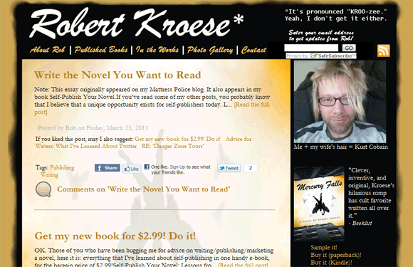
What Works: I mentioned one common mistake with author sites is the use of extremely dark backgrounds with light text (which becomes difficult to read for any extended period). But Robert Kroese's site is a good example of how you can combine darker design elements to make an impact without negatively impacting the readability of your website.
James Sperl
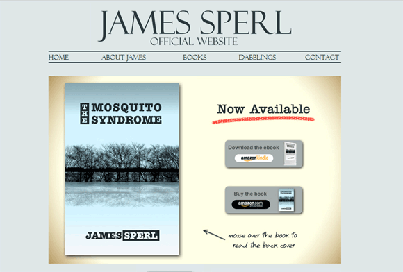
What Works: This site illustrates how you can use typography to keep a site visually interesting. It has beautiful font choices and its main content areas are some of the most easily readable I've come across.
Elisa Lorello
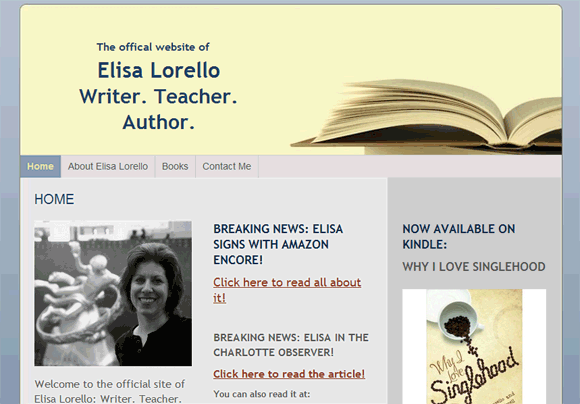
What Works: Elisa Lorello's site sticks to the basics and shows how simplicity can be both beautiful and functional in Web design. It's a good example of how you can build visual interest even with just the basics like your author and book images. You don't need an image-intensive design to make your author site work. My only suggestion here would be to give readers a bit more of a bio.
Christine & Ethan Rose
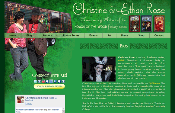
What Works: This author site is actually the opposite of the previous one. Here's an example that is more design intensive. And you know, it works too. This is why it's so important to know your audience. Your design shouldn't look like any other random author's site. It should be something that appeals to your readers. And this design adds character that works well with the image I get from checking out the books (although I admittedly haven't read them, so if you have you'll know far better than me).
Elita Daniels
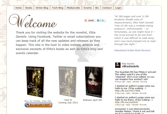
What Works: Elita Daniels' website is another shining example of simplicity at work. It isn't "plain" but it also isn't such an extravagant site that it takes any focus away from the books. I talked to her husband Paul, who handles the tech side, on Twitter about the site design and I noted that the fonts just weren't working for me. It was that typical issue of serif fonts being used too heavily for on-screen reading, and in too small of a font size (which can look fine on larger screens in the design phase, but become painful for any reader using a laptop or smaller monitor). He changed the fonts. And I have to say that little change made all the difference. The site is absolutely gorgeous now. The readability was improved. It looks clean. It gives you what you want on the content side. It's precisely what an author site should be.
You don't have to model your own author website after these ones. But hopefully you'll find some little bit of inspiration in one of them -- some "aha!" moment that makes you rethink potential problems with your own or that gives you ideas to help you get started with a new site.
In our next post on author site design I'll share some tips and resources that can help you build a better website to promote your books and e-books, even if you don't have a tech savvy bone in your body.
Good showcase of author websites. Gotta say I’m usually appalled at the ones I’ve encountered in the past. Even so, I’ve got the bare minimum up on mine because I’m looking at getting some more content on it before I get too design-intensive. It is plain, but not broken or completely hideous.
Looking forward to more – especially your site being rolled out!
It’s important to note that a good site doesn’t have to be “design intensive.” Minimalist sites can be gorgeous in their own right. I think a part of the problem is that writers often think their content should be enough. And it’s not. Design does matter, like it or not. Unless you’d go on a book tour wearing a paper bag, don’t promote online using the virtual equivalent either.
With a more minimal design you’d just want to focus on things like color choices for headlines and typography. And you don’t need to have a lot of content up yet to figure out a good strategy for things like that. Remember that first impressions matter. So waiting too long could lead to lost readers who got a bad impression because they stopped by a site before you were really ready for them.
So always always always get the basics down early — testing links, testing fonts on different screen resolutions, testing in the most common browsers your visitors would use, making sure your color choices make sense, etc. (note none of those suggestions are about your site in particular — just general comments on the importance of not waiting). 🙂
Hi there. I enjoyed your post and have been searching for themes for authors. I too, like the minimalist themes, but I wish there was a bit more back end functionality discussion (for example widget placement) and column availability. I have been going back and forth on the use two side bars, using Adsense, in manner that doesn’t take away from the actual blog posts. Designing your personal blog/website become an art-in-and-of-itself, because like our pesky siblings our websites tend to reflect something about ourselves…if you want, check out what I have done in a side project: www.SeattleCoffeeScene.com. Thanks for the discussion!
Great list and analysis here, Jennifer. I look forward to checking some of them out. I’d love to tell you about the author website template for self-hosted WordPress sites from our company, 30 Day Books. We built it with authors in mind, and it has a book portfolio as well as Amazon, GoodReads, and social media integration. A preview page is here: https://www.30daybooks.com/authorlicious-wordpress-theme-preview-page/ Many thanks, Laura
A great list of writing resources, thanks for sharing! I love James Sperl’s site, and recently published a guest post on my site with a few additional gems you might like to check out. Happy writing! https://catehogan.com/top_ten_writing_sites/