When we looked at 5 freelance writer websites done well, I critiqued some professional writer websites to give you ideas about how to improve your own. I also opened it up for review requests for others who wanted public site reviews here on the blog. Yolander Prinzel was the first writer to take me up on that.
Yolander is a freelance financial writer, and back when this was a group blog, Yolander was a regular contributor. (Read her post archive.)
Let's take a look at her site. Then, like in the previous round-up, I'll go over some highlights that strike me as strengths as well as some suggestions where the site might be able to be improved.
Yolander's Site Summary and Highlights
Yo's site is a fairly standard site promoting business writing services. She keeps the look simple and serious which is appropriate for the industry she specializes in. And she emphasizes her credentials throughout the site -- more important in the financial niche where being a subject matter expert can have a significant impact on her value to clients.
Here's a quick peek at the homepage of Yolander's freelance website.
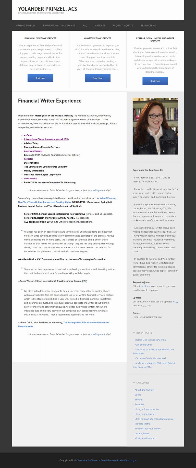
Here are some highlights from Yolander's professional site:
- It's audience-appropriate.
- It's fairly easy to navigate.
- There are plenty of samples included, and a diverse collection at that.
- She offers decent service details (not simply a list).
- Her contact form is designed specifically for quotes rather than a generic option.
Suggestions for Yolander's Site
Now Yo and I have known each other a long time and I know she wants the feedback. So I'm going to be nit-picky here in my suggestions. Let's jump right in:
- While the individual navigation options are straightforward, the navigation's organization feels awkward to me. I'd suggest having service info before samples for example. Samples exist as supplementary material if prospects need more convincing. But here they're pushed as the most important thing.
- Speaking of Yo's samples, the portfolio needs a once-over. There are some samples without links like "Reporting Software Brochure" (maybe removed by a broken link checker plugin?). There's also a simple stylistic problem here where links have different colors. So some seem to be assigned inline styles in the html instead of inheriting the style from the stylesheet. The lower links (showing in dark text) are the ones that need manual styles stripped out.
- Also on the samples page, there are some email links. But Yo already has a quote request form on her contact page which gives prospects some direction about the kind of info she needs from them. So I'd link them to that page rather than having links that pop open a blank email. This happens with the CTAs at the end of other pages too, so again I'd link to the contact form.
- Speaking of which, the contact form only has a quote request form. That could be confusing for people who might have questions when they aren't ready to buy yet. I'd suggest adding the email address here as well, or at least an email link for more basic questions (like the links currently on her portfolio page).
- Back to the contact form, there's a note in the sidebar that when people visit it they might need to have pop-ups enabled. I'd remove that. A) It makes the site sound dated. And B) the form seems to be embedded anyway, so it shouldn't have anything to do with pop-ups.
- I'd change "Articles" in the navigation to "Blog." It's linking to a blog that has not only articles but also news updates about Yo's services. If it were only an article archive, I'd say to leave it alone. But it doesn't feel accurate if you click looking for financial writing content and see delay info due to storms first in that list.
- Check the style being used for blockquotes. The text is a fairly light gray. Blockquotes should pop against your main copy. This color choice makes them fade into the background more instead.
- I mentioned this in feedback on some of the previous sites as well, but I'd suggest adding an About page. Again, it's simply a standard page people look for when visiting business sites. And when you're a solopreneur it's even more important to give people a glimpse of who they're working with. Yes, Yolander gives her credentials elsewhere. But a sidebar isn't where most visitors are likely to think to look. Make the info they'll want easily accessible and as intuitive as possible.
- Get back to updating the blog, even if it's only a post or two each month. Or at least remove the "recent posts" section from the sidebar. Right now the latest 5 posts are being shown all over the site in that list. And the fifth mentioned 2014 right in the title, making the site look dated and neglected.
- Finally, the one area that felt a little confusing was the set of three service pages. Technically they're all related to finance writing, so I couldn't figure out why services were split through several pages instead of all summarized on the main one. Now, Yolander knows best what specific services her prospects approach her about, so splitting them how they are might be for very good reason. But if not, I'd say maybe combine these. At the very least, interlink them and try to make the "Non-Fiction Editing and Other Services" page more directly finance-related. If you don't catch that niche reference early, the services could be related to anything.
And I think that sums it up. Overall, Yo's been around awhile so I'm sure she's landing gigs in ways beyond her website. But making things a little clearer in the ways mentioned above might help improve conversions a bit by getting prospects the info they want and need most. And updating things (like blog posts and the pop-up reference) can give the whole site a more current feel.
Check back tomorrow for another freelance writer website review. And if you're ready to improve yours, consider doing your own simple content audit or use my own website review as an example to guide you.